Game UI (menus & HUD)
Scores, lives, health bars, pause buttons, title screens and game-over menus are UI elements: objects with a UI element component, drawn flat on top of the game.
Add UI
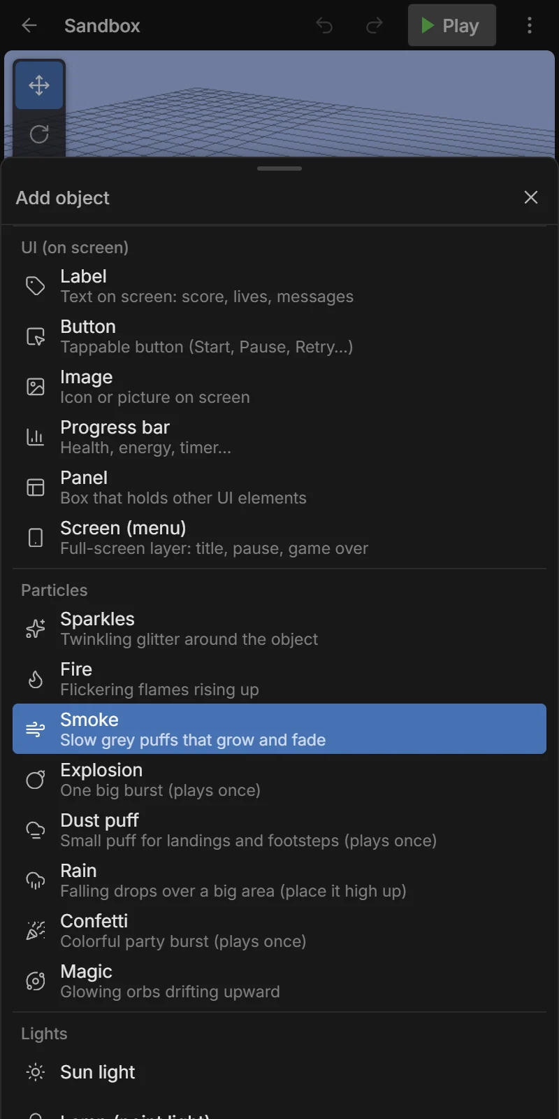
Objects → + Add → UI (on screen):
| Item | Use for |
|---|---|
| 🏷️ Label | Text on screen: score, lives, messages. |
| 🔲 Button | Tappable button: Start, Pause, Retry… |
| 🖼️ Image | An icon or picture. |
| 📊 Progress bar | Health, energy, a timer, level progress. |
| 🪟 Panel | A box that holds other UI elements. |
| 📱 Screen (menu) | A full-screen layer: title screen, pause menu, game over. |
UI mode
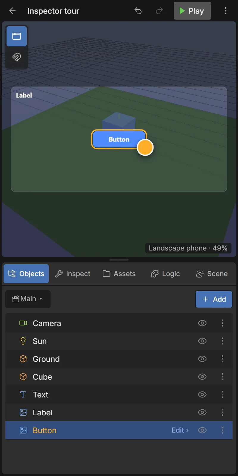
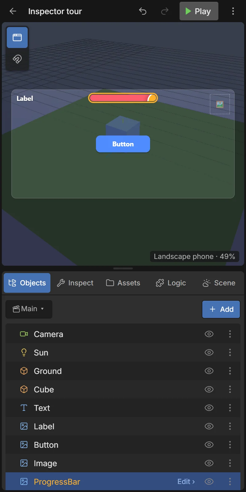
When you select a UI element, the 3D view switches to UI mode: it shows the game screen as a phone-shaped frame. Tap an element to select it, drag to move it and pull the orange corner handle to resize it. The UI button in the viewport toolbar switches UI mode on and off; Snap moves in 8 px steps.
Placing: anchors and offsets
A UI element is placed by an anchor — a corner, an edge or the center of the screen (or of its parent panel) — plus an offset in pixels. That keeps it in the right place on every screen size: a score anchored top-left stays in the top-left corner on a small phone and on a tablet.
Tap one of the 9 dots of the Position grid to choose the anchor.
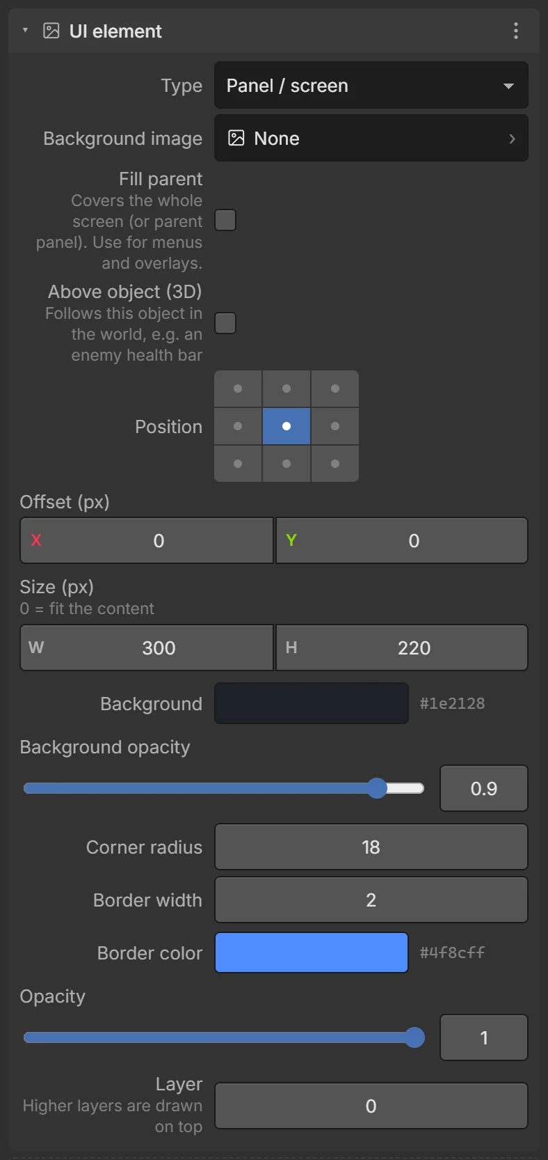
UI element settings
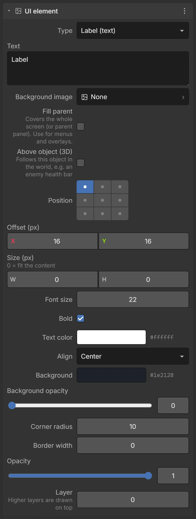
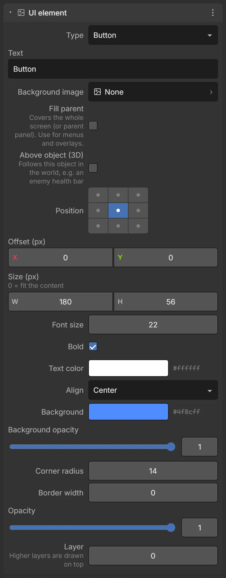
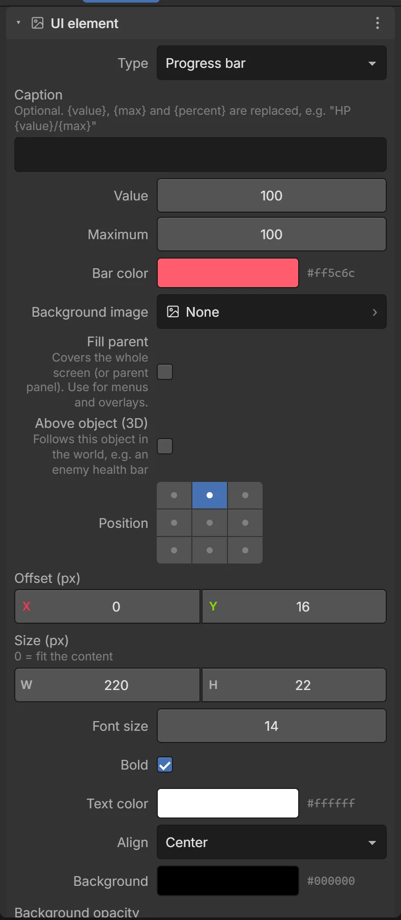
| Field | What it does |
|---|---|
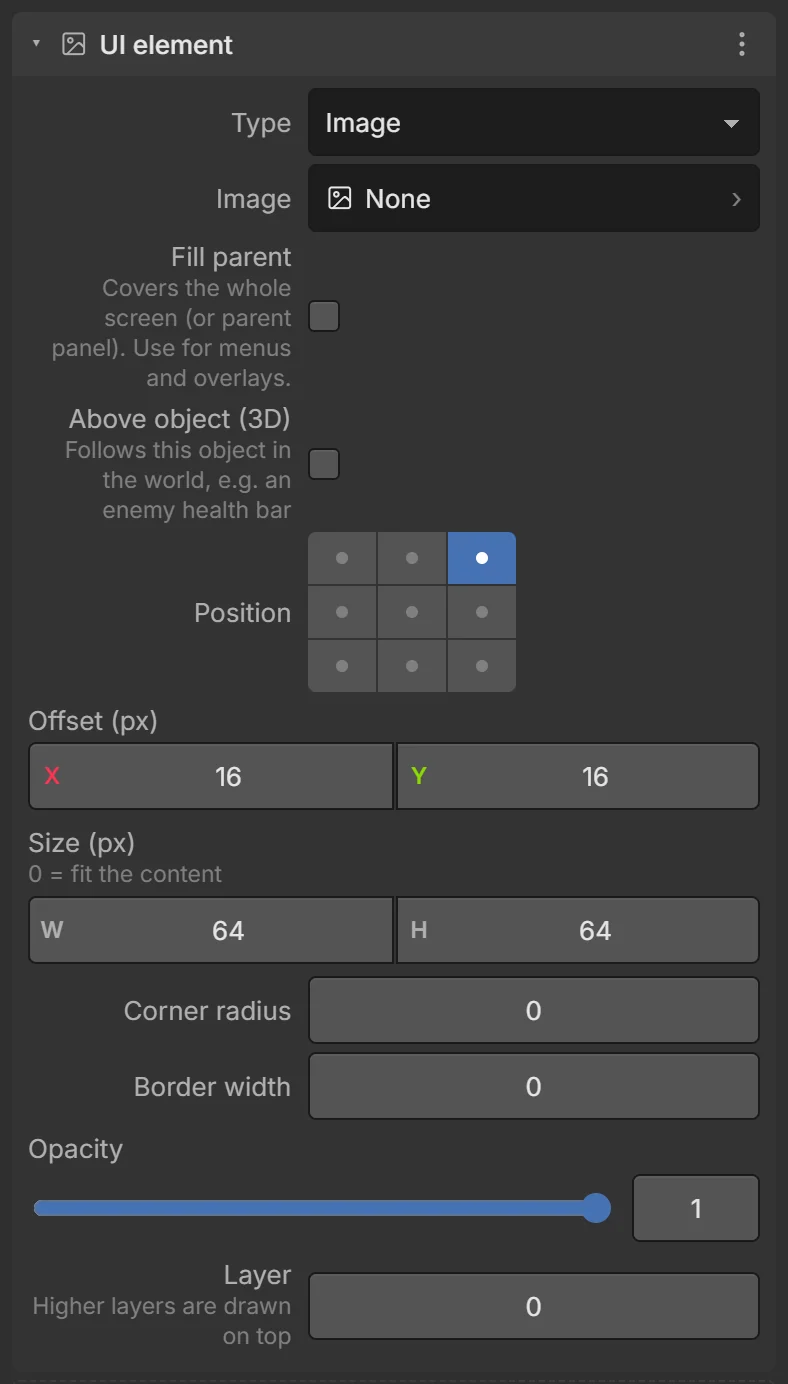
| Type | Label (text), Button, Image, Panel / screen, Progress bar. |
| Text / Caption | The text. For bars {value}, {max} and {percent} are replaced, e.g. HP {value}/{max}. |
| Value / Maximum / Bar color | (Progress bar) How full it is. |
| Image / Background image | A picture (image kind) or a background for buttons and panels. |
| Fill parent | Cover the whole screen (or parent panel). Use for menus and overlays. |
| Above object (3D) | Follow this object in the world — e.g. a health bar over an enemy. |
| Position | The anchor (9-dot grid). |
| Offset (px) | Distance from the anchor. |
| Size (px) | Width × height. 0 = fit the content. |
| Font size, Bold, Text color, Align | Text style. |
| Background, Background opacity | Fill color; 0 = transparent. |
| Corner radius, Border width, Border color | Shape of the box. |
| Opacity | Of the element and everything inside it. |
| Layer | Higher layers are drawn on top of lower ones. |
Screens and panels
A Screen is a full-screen panel. UI added while a screen or panel is selected goes inside it (it becomes a child). Showing or hiding the screen shows or hides everything in it — so one action opens a whole menu.
A typical pause menu:
- Add a Screen named
PauseScreenwith a dark, half-transparent background; turn its Visible off. - With
PauseScreenselected, add a Label “Paused” and a ButtonResumeButton. - Add a Button
PauseButton(outside the screen) anchored top-right. - Events:
- WHEN PauseButton: On clicked → PauseScreen: Show, System: Pause game
- WHEN ResumeButton: On clicked → PauseScreen: Hide, System: Resume game
Screens that start hidden are still shown in the editor when you select them or something inside them.
- A panel with a visible background blocks taps to the game behind it.
- A button’s taps never reach the joystick or On screen tapped.
UI in events and expressions
- Conditions: On clicked ⚡, Is held down, Compare bar value.
- Actions: Show, Hide, Show / hide, Set label, Set bar value, Add to bar value, Set bar maximum, Set image, Set background color, Set text color, Set bar color.
- Expressions:
HealthBar.value,HealthBar.max,PlayButton.pressed,ScoreText.text.
See the UI conditions and UI actions.
The Text component
The older, simpler Text component (+ Add → Text) shows text anchored on screen, or floating above the object in 3D (Above object (3D)) — good for name tags and damage numbers.
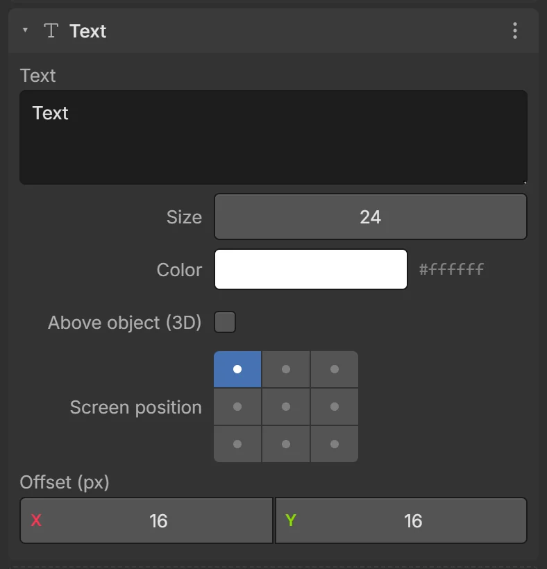
| Field | What it does |
|---|---|
| Text | The text (several lines allowed). |
| Size, Color | Font size and color. |
| Above object (3D) | Float above the object instead of sticking to the screen. |
| Screen position | The anchor (9-dot grid). |
| Offset (px) | Distance from the anchor. |
Change it with the Set text / Append text actions. For menus and HUDs, prefer UI elements.